

Case Study
Transforming an emerging digital wellness initiative into a clear, compelling service story

Duration
Aug 2025 - Present
Main Task
Clarifying Value propositioning through website redesign, polishing the product.
Hats Worn
UX Research
UX Design
Product Strategy
Branding
(Design Lead - Design Team of 6)
Tools
Figma
Illustrator
Claude
Framer
Status (In Progress)
About
ProAction Entrepreneur is a nonprofit startup initiative dedicated to improving the mental health and well-being of entrepreneurs and their support systems. Their mission is to prevent distress and burnout for entrepreneurs and equip accelerators/investors with tools such as trainings, and hub of care access and events that reinforce the vision that entrepreneur success should not come at the cost of their health
The Brief
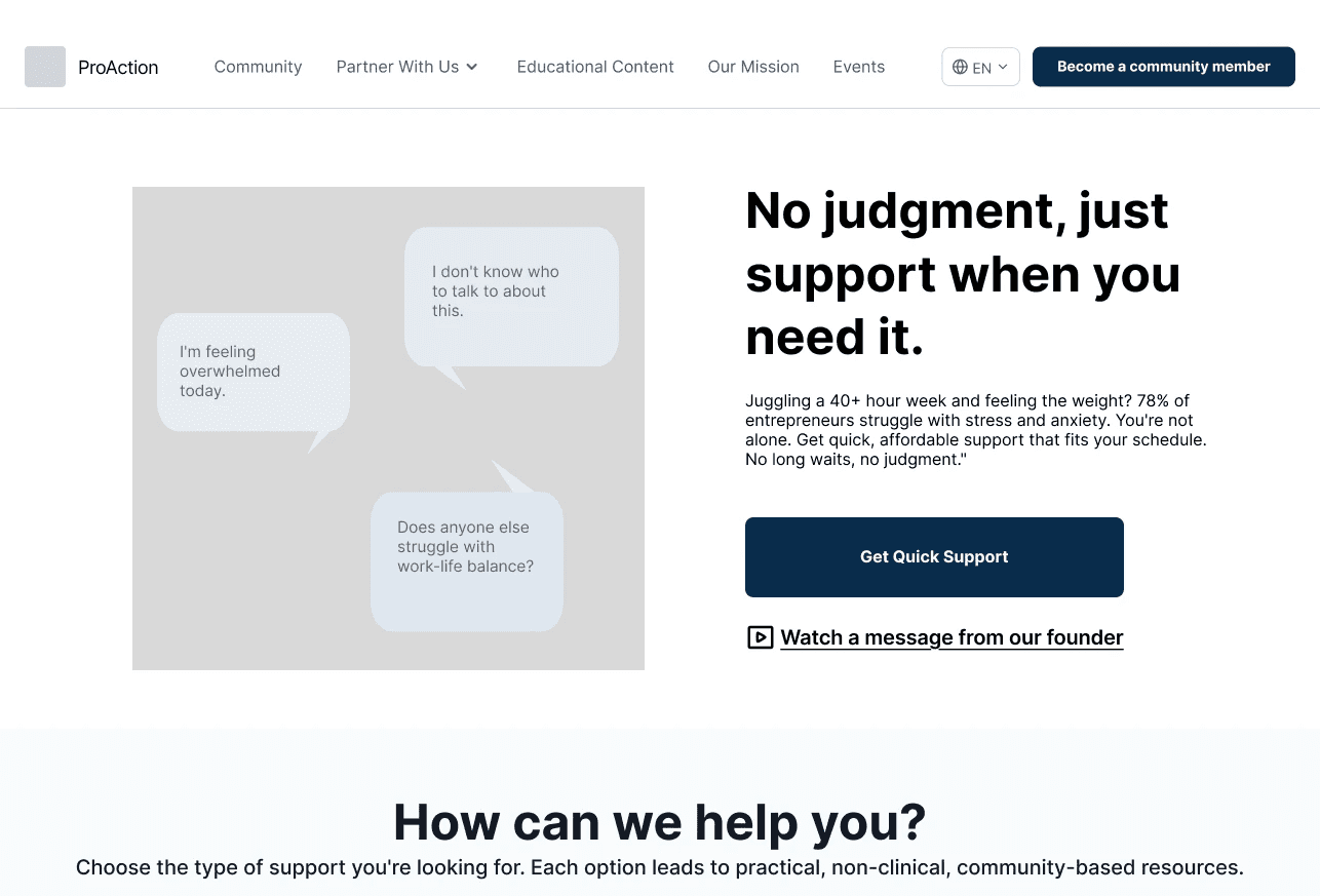
ProAction Entrepreneur brought our team on board with a broad mandate: Develop a Research and Design Strategy to directly inform how they position themselves in the market as an entry level wellness startup geared toward entrepreneurs, clarify their value offering, and build trust to increase conversion while ensuring every decision is rooted in creating a digital environment to foster entrepreneur wellbeing, normalizing the taboo of support seeking.
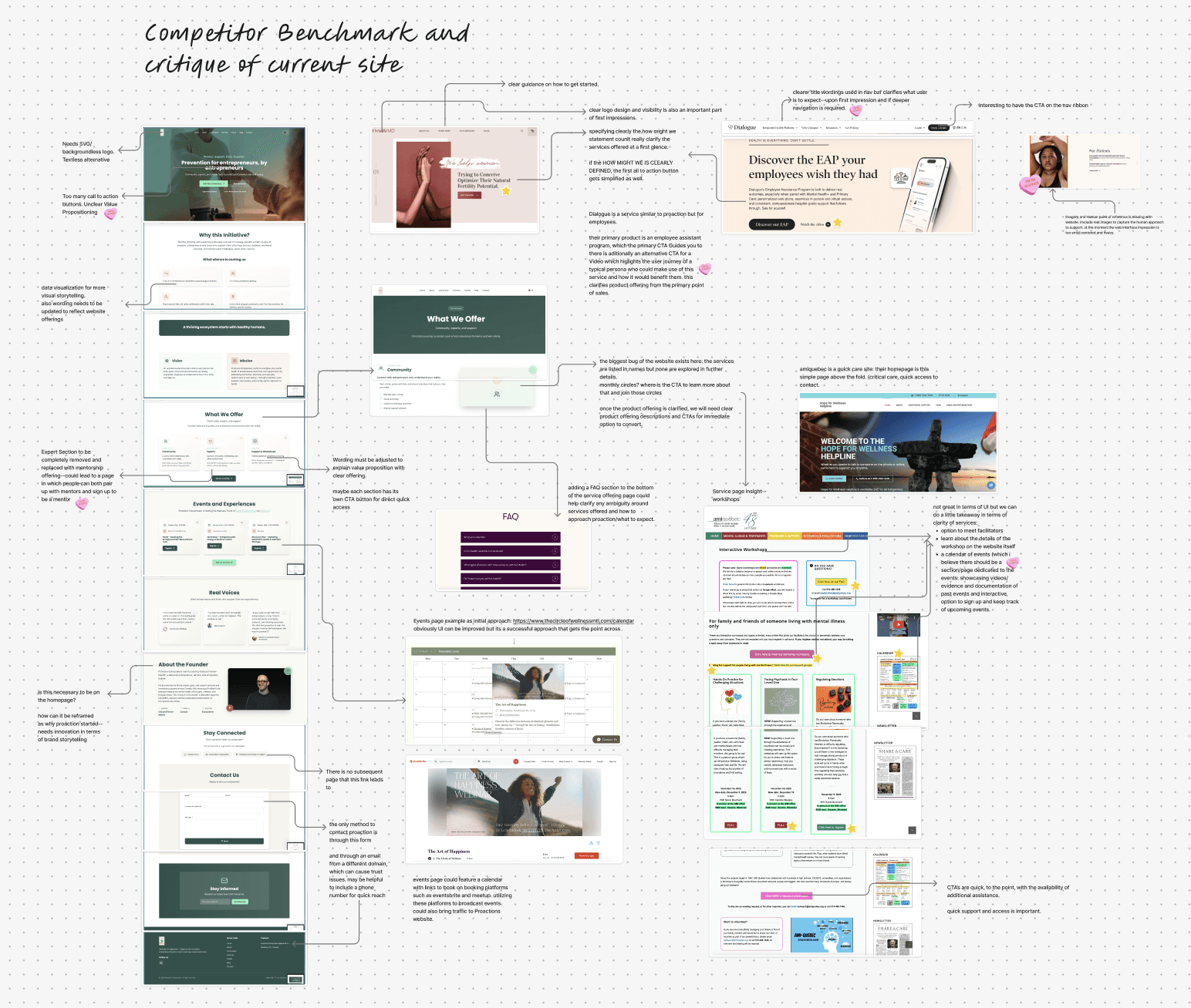
What was our Process?
This project came to us in its early days, lots of promise, but still taking shape. That meant we couldn't skip ahead to design. We needed to first get clear on what the product was and the value it offered, then build out the UX and online experience to connect with users and guide them toward conversion in a friction-free manner. And we had to do all of this within a tight four-month timeline, finding a scope that would bring meaningful product clarity without overreaching.
The Roadmap at a Glance
Our Assumption Mapping
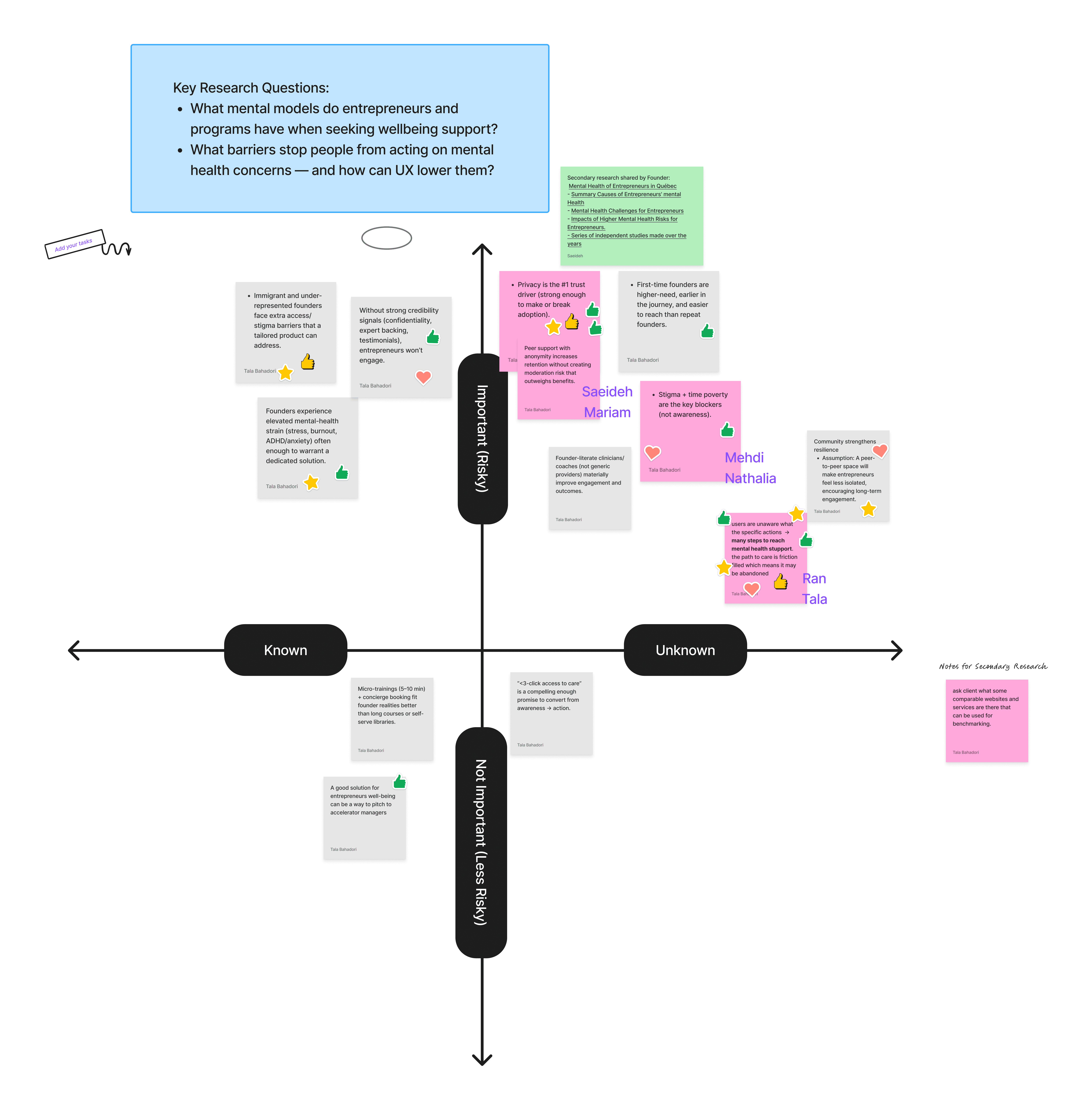
Our Research
72%
of entrepreneurs experience at least one mental health condition
Freeman, MA, et al, 2015-2019
Primary Research
Survey/Questionnaire Filled by Entrepreneurs
of participants prefer quick and easy access to support, but support paths are complicated and time-consuming
of participants claimed wanting community
but
only
utilize any form of community
Humanizing Our Findings Through Sofia

Sofia Martinez
"The Resilient Juggler"
42 yrs • Montreal
Founder & CEO
$300K sustainable fashion e-commerce
Some days I feel unstoppable. Other days, I'm answering emails during my daughter's bedtime story wondering if I'm failing at everything that counts.
Her Journey with Proaction and Reason for Task Abandonment
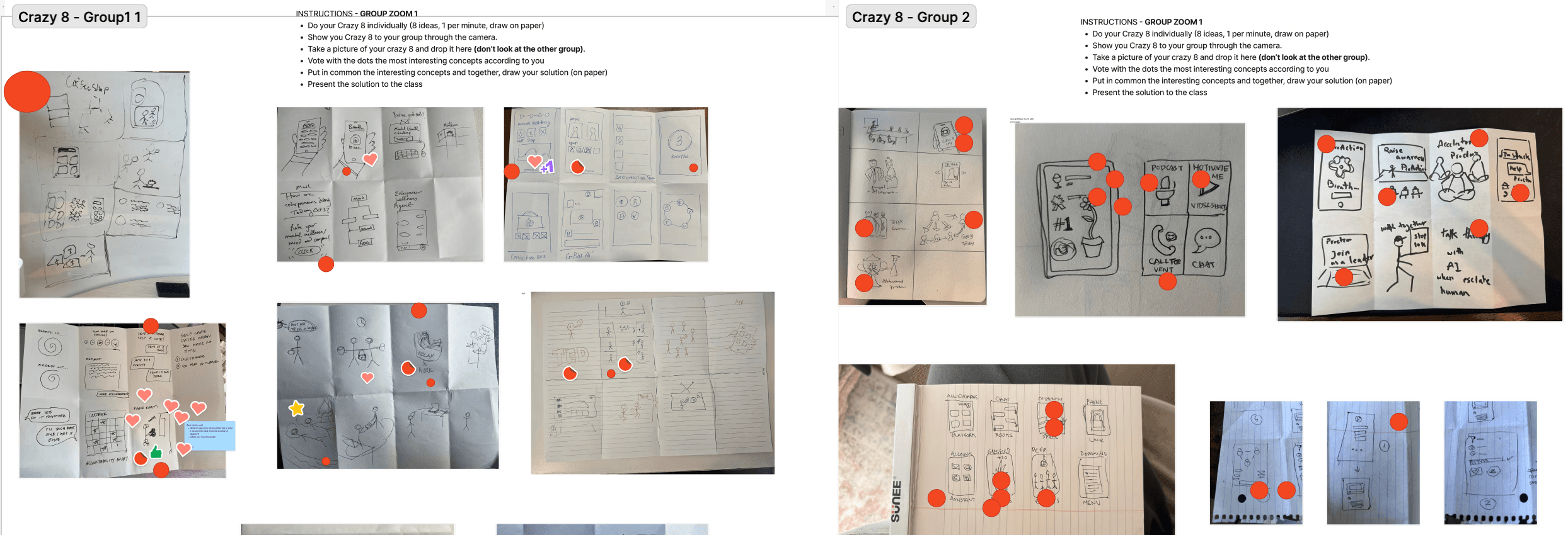
Ideation Overview

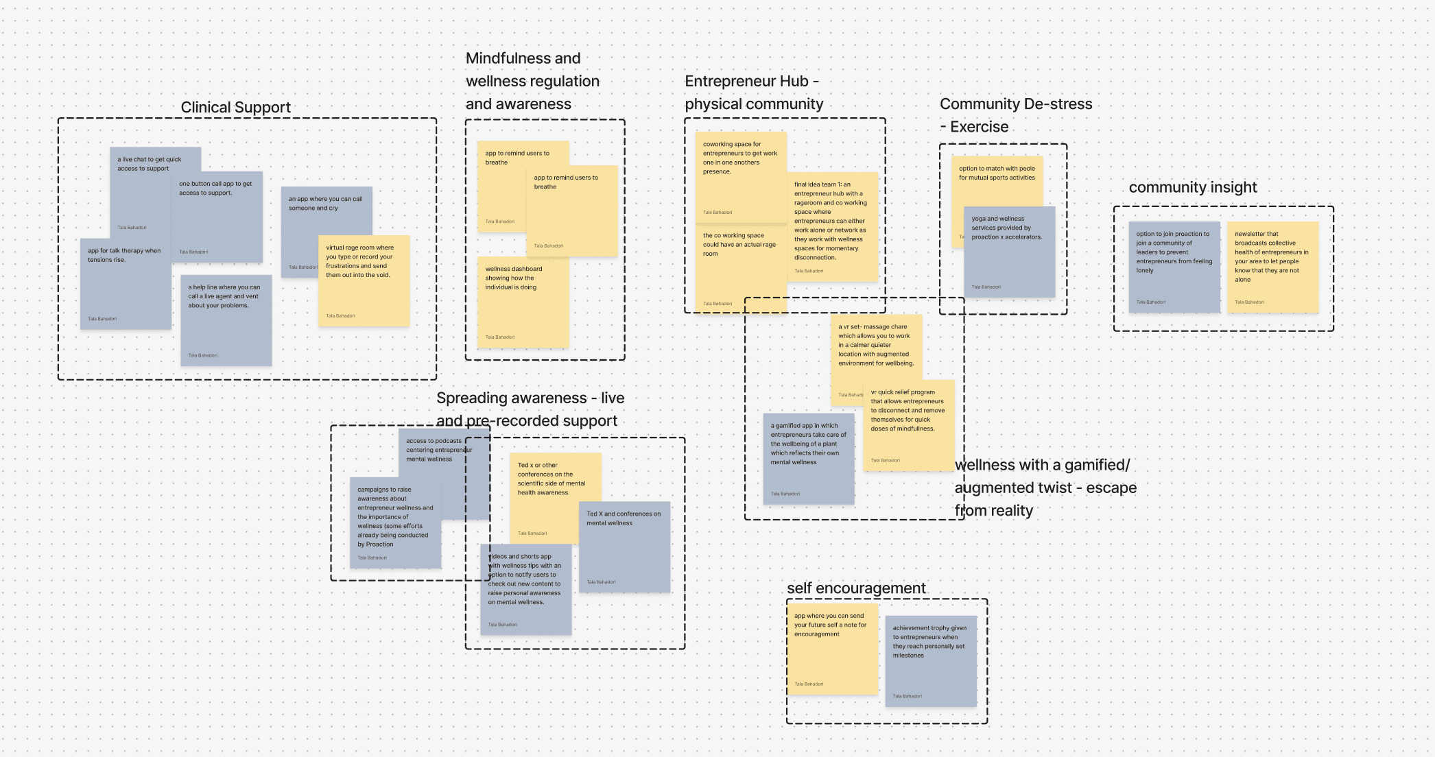
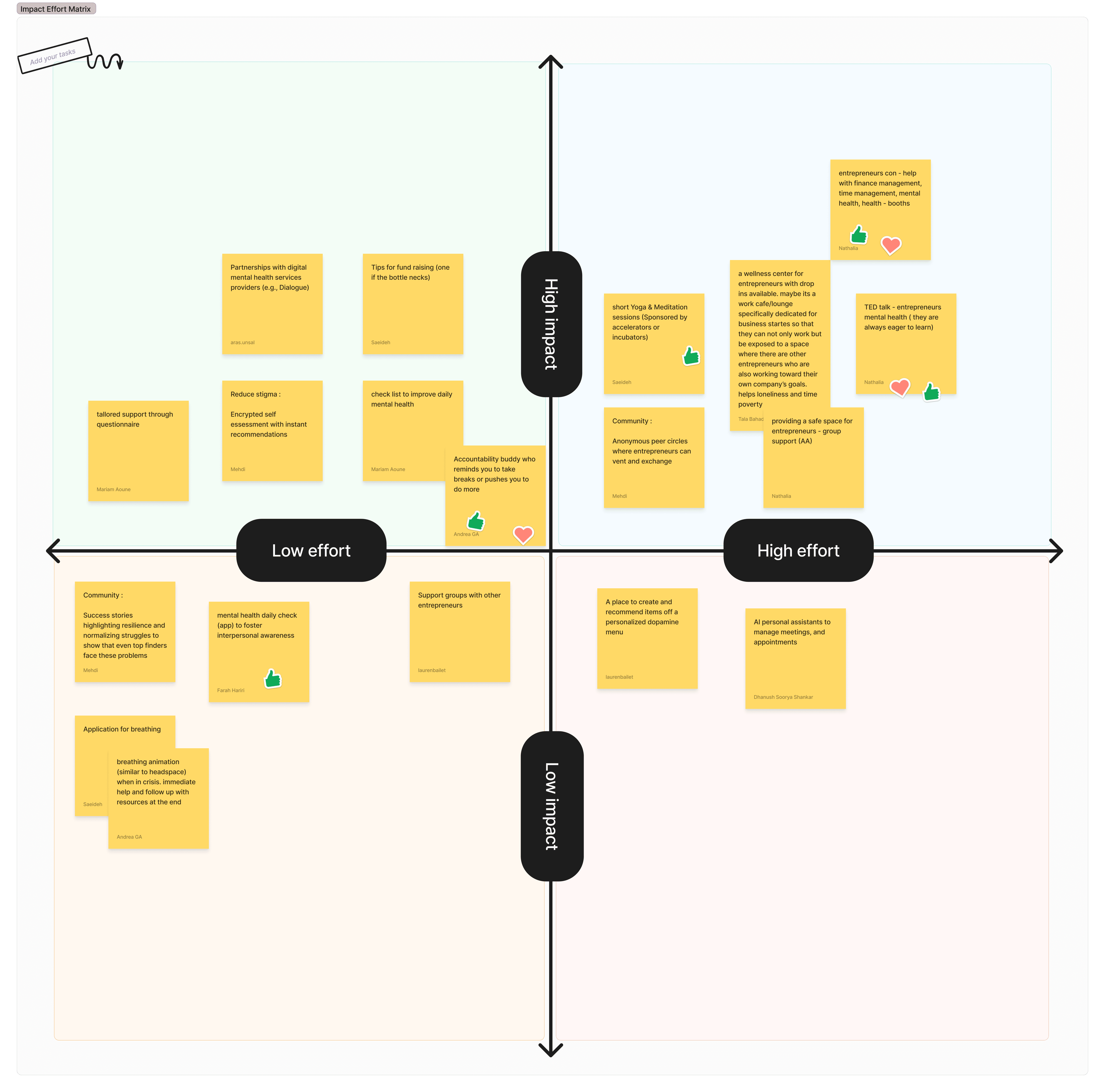
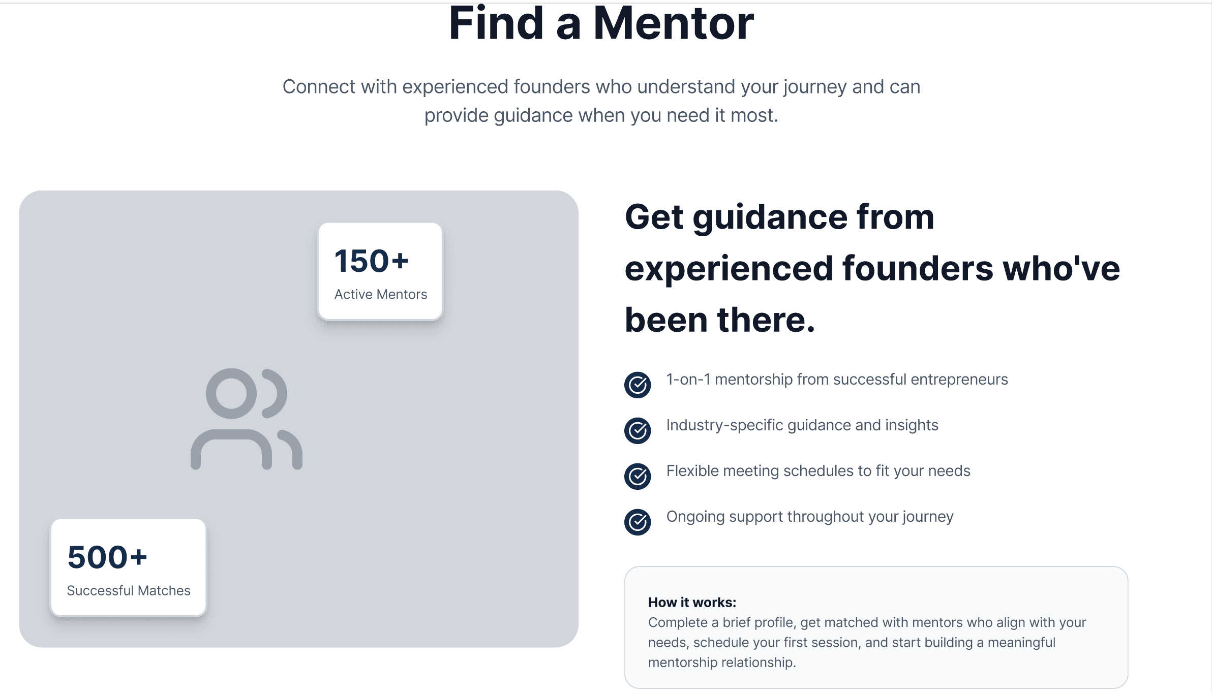
Quick Support
Daily checks, breathing app, Live Chats. Mentorship Matching.
Community Cultivation
Anonymous circles, success stories, accountability buddy support groups.
Educational Content
Wellness centers, conferences and talks on mental health, content on entrepreneur wellness.
Clinical Support
quick access to support through professional providers; one-on-one sessions.
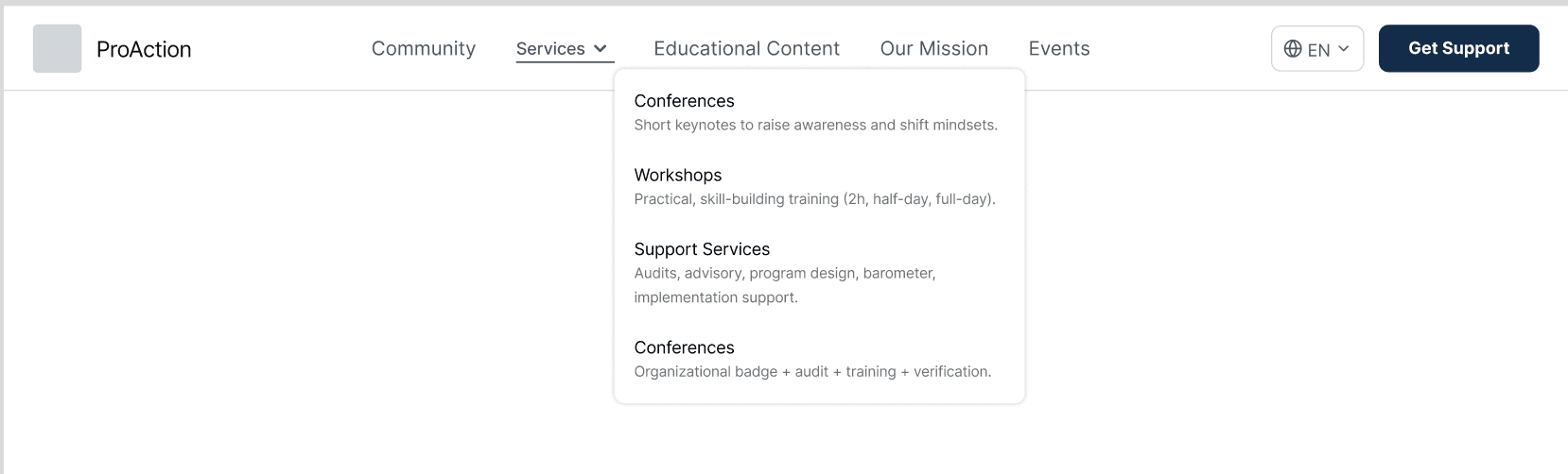
Sitemap Drafting

The final pretested sitemap involved two main CTAs for support: one leading entrepreneurs towards all support pathways and the other for getting immediate support during crisis as well as a vertical service flow for B2Bs under the services tab.

The first draft prototyped for usability testing
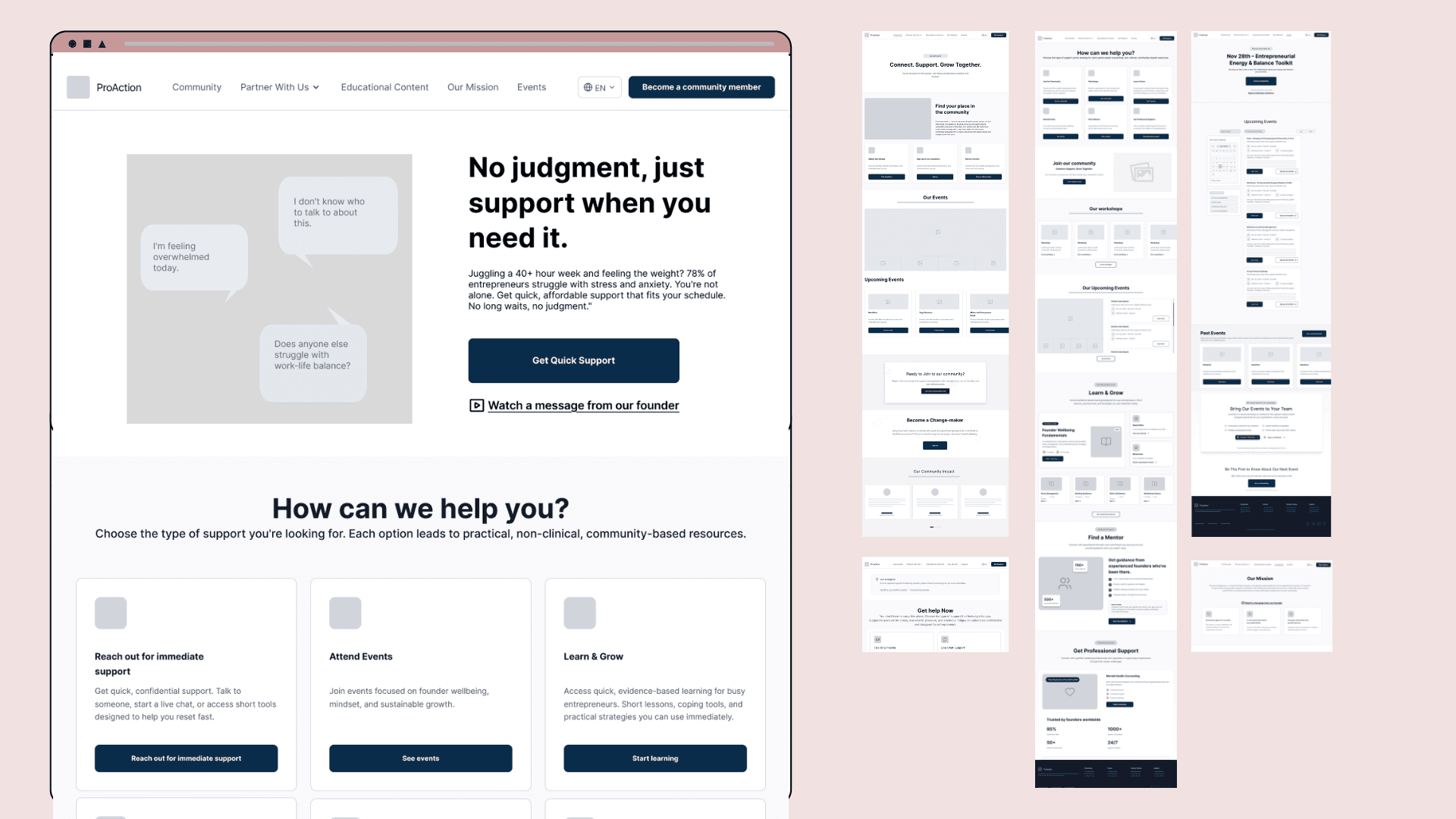
6
Pages Designed
6
Usability Tests Conducted
4
Iterations Made

Client Testimonial